Top 10 Responsive Web Design Tutorials
The use of mobile devices such as iPad, iPhone and other smart phones has increased a lot in the last few years and this represents the main reason why responsive web design started to gain more importance in web design. A responsive website is one that can easily adapt its layout and design to fit in any device resolution. In this post I share with you 10 useful responsive web design tutorials which I’m sure will help you understand better this concept and design more complex websites. If you’d like to get some responsive web design inspiration, read the fopllowing articles: 10 Incredible Examples of Responsive Web Design , 10 Amazing Responsive Image Galleries and 10 Amazing Responsive WordPress Themes .
Responsive Web Design for Beginners

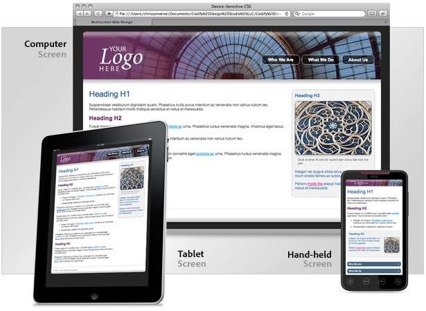
Responsive Web Design

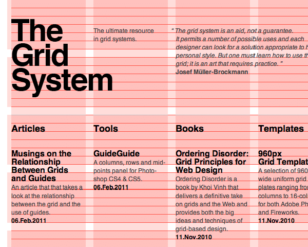
Fluid Grids

Designing for a Responsive Websites
Adaptive layouts with media queries
 Subscribe to our RSS Feed
How To Use CSS3 Media Queries To Create a Mobile Version of Your Website

Techniques in responsive web design
Responsive Web Design with HTML5 and the Less Framework 3
Responsive Web Design: What It Is and How To Use It
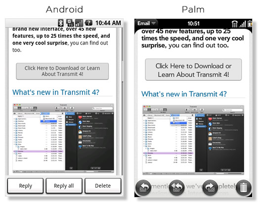
Optimizing your email for mobile devices with the @media query